Using NimbleStory Pages for Interactive Content
📔 Overview
This article explains how to use Pages effectively. Pages is a tool for developing single-page websites, ideal for creating content like Concept Explorers and interactive visual assets. By using Pages, you can enhance your NimbleStory project with dynamic content and greater interactivity, offering a more engaging experience than PDFs or basic articles.
Users with create or curate access will find Pages intuitive, especially if they have experience with design tools like Webflow.
📘 Instructions
Follow the step-by-step instructions below to efficiently use Pages for creating dynamic single-page websites.
Add A Page
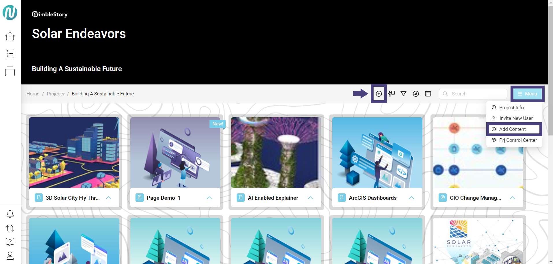
Navigate to your project space. You can add a page in two ways: (1) Click the circle with the plus inside or (2) click the Menu button and select Add Content:
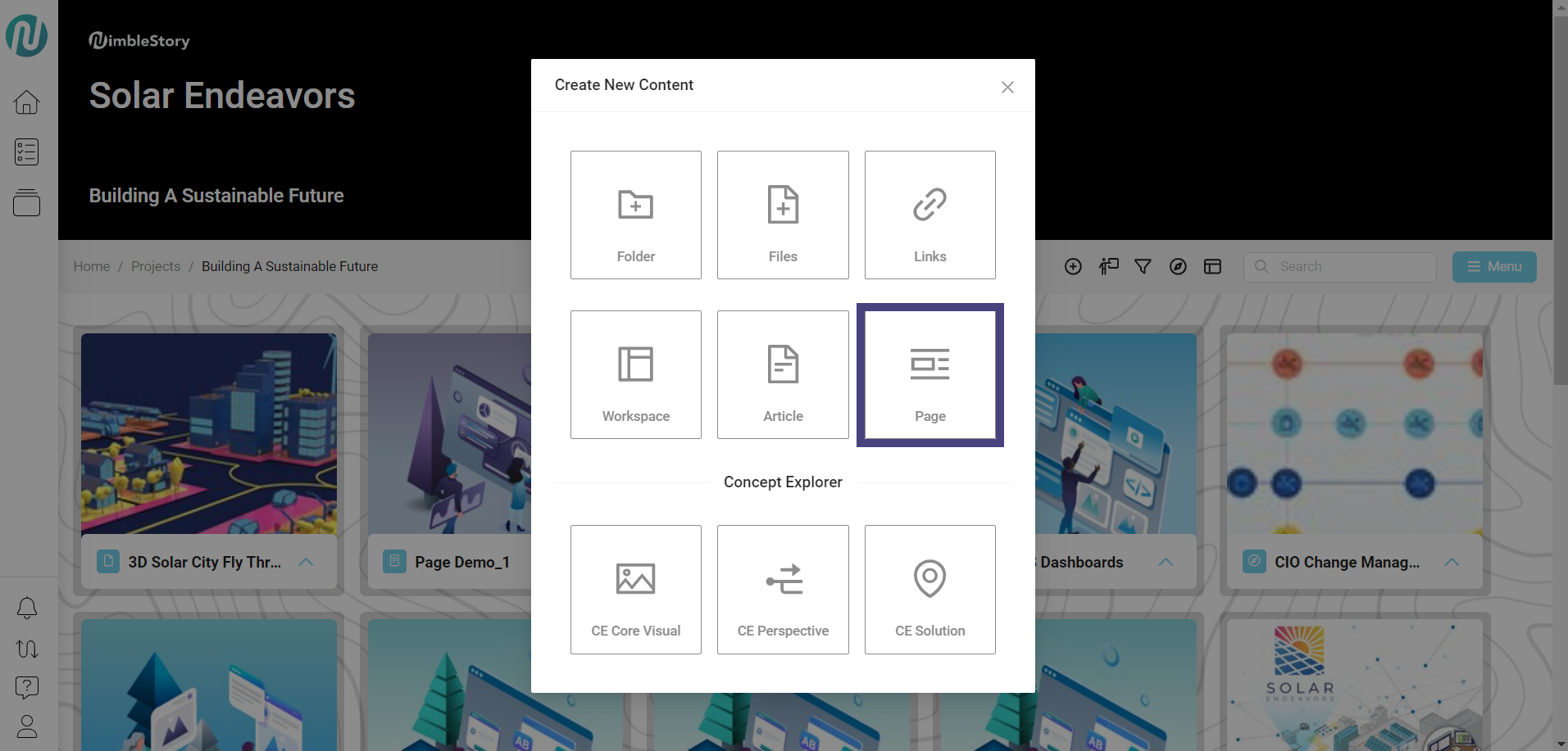
Select Page:
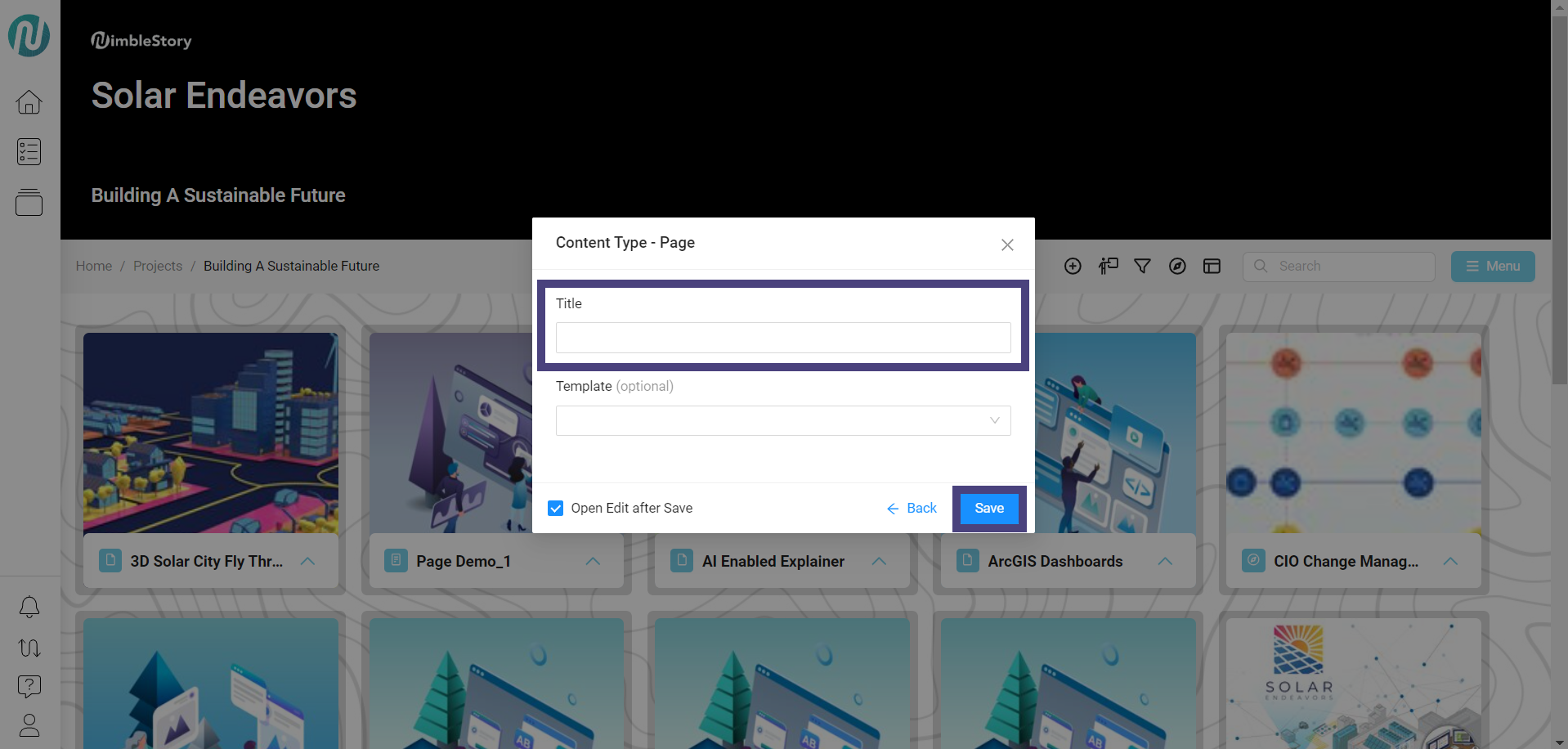
The new page view will open. Enter the new page Title and click Save:
The editor view of Page opens up:
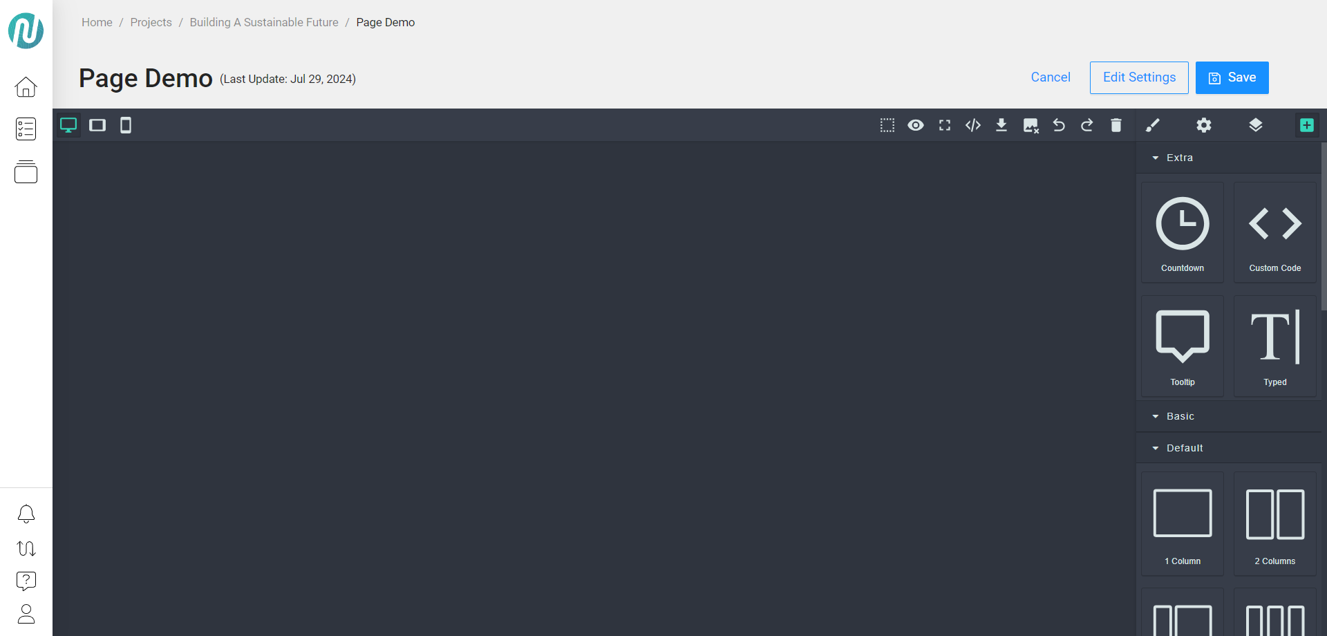
The editor view will open in a blank state with no content. If you have used visual editors like WordPress or Squarespace before, this will feel familiar. It allows you to visually edit, annotate, and build your site pages.
Introduction to the Editor
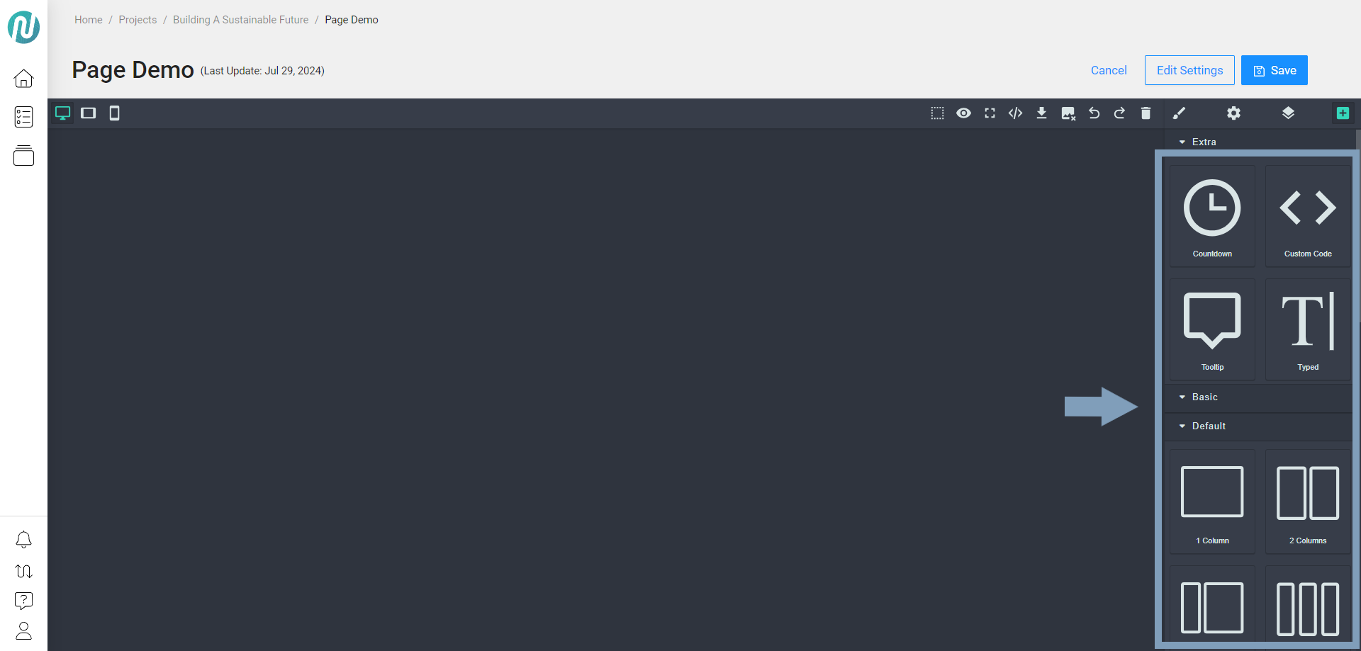
Core Assets
The core assets will appear on the right, including various types of containers and elements that you can visually drag into your page to build your desired content:
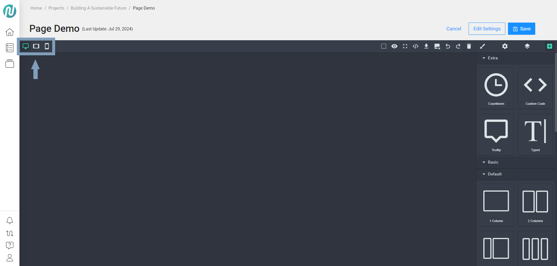
In the upper left, there are several elements that allow you to test scalability, showing how the experience looks on desktop, tablet, or mobile devices:
In the upper right, you can access the components view:

Listed in order from left to right:
View Components (dotted box): Displays the selected components in the canvas.
Preview (eye): Visualizes the content without the editor.
Fullscreen (4 corners): Expands the canvas to full screen.
View Code (</>): Shows the source code.
Download (down arrow with line underneath): Enables downloading of the content.
Remove Image (image with x in lower right corner): Deletes the selected image.
Undo/Redo (arrows pointing left and right): Reverses or re-applies the last action.
Trash (trash can): Clears the entire canvas.
Open Style Manager (paintbrush): Allows edits to the style manager.
Add Core Assets
In the editor view of Page, drag and drop new core assets onto the canvas:
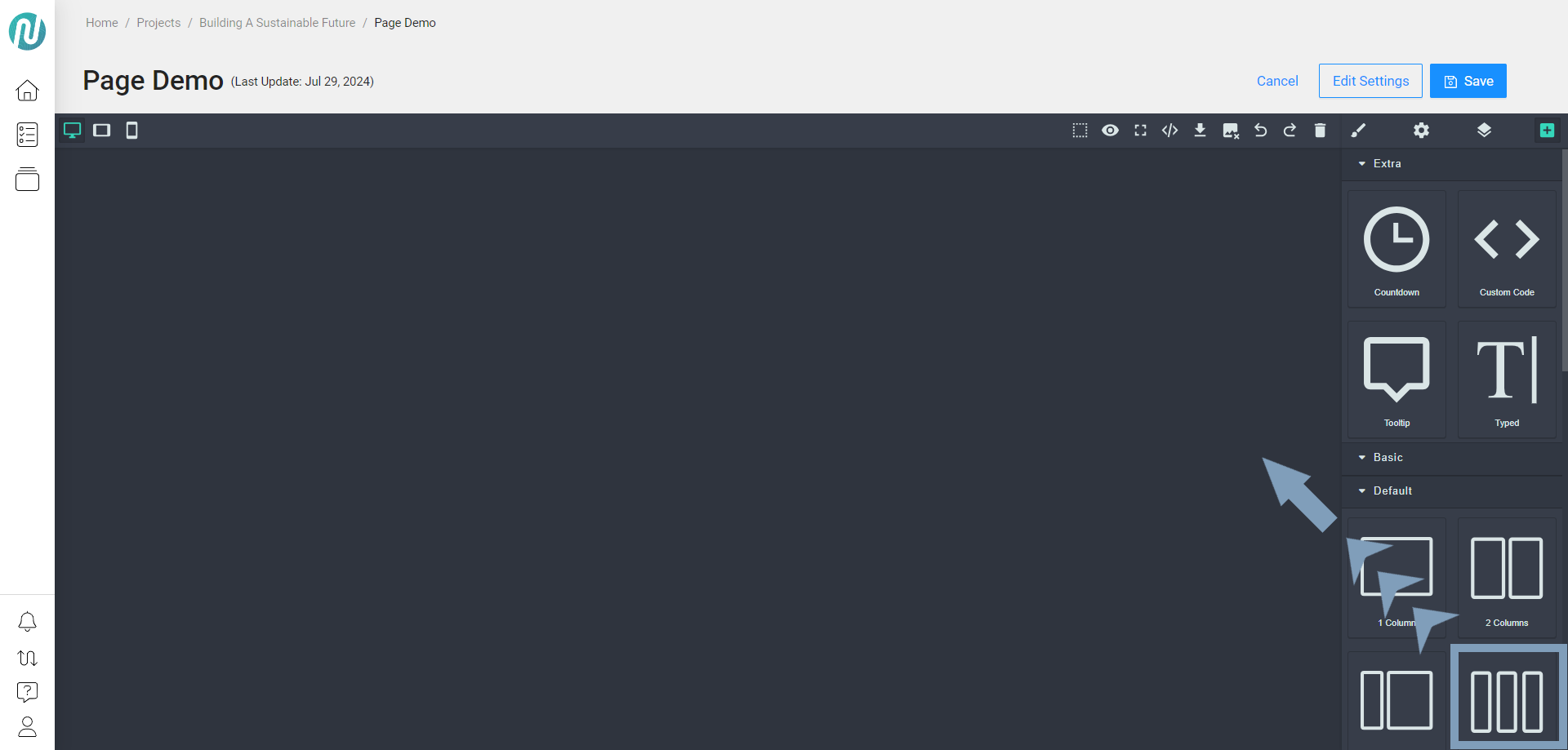
In the example above, the 3 Columns core asset is dragged and then dropped onto the canvas.
The Style Manager will then be added:
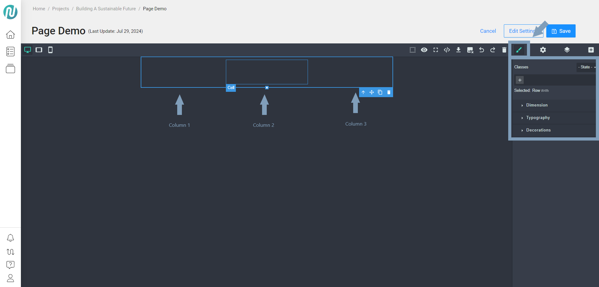
With the 3-section column added, you can insert different components into each column. Hovering over a section will preview the space.
In the example below, 3 different components have been added to each section:
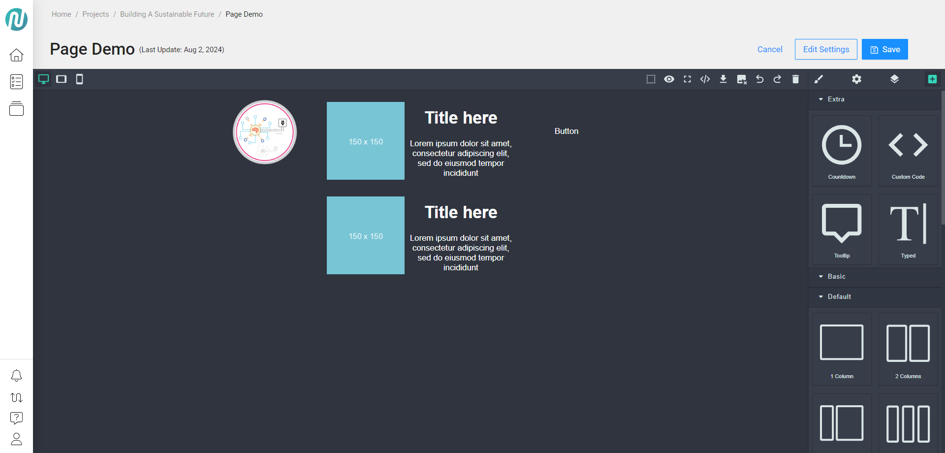
From left to right, the added components from the core assets are:
Column 1: Image
Column 2: List item
Column 3: Button
You will now see all your components listed when the Open Layer Manager is chosen:
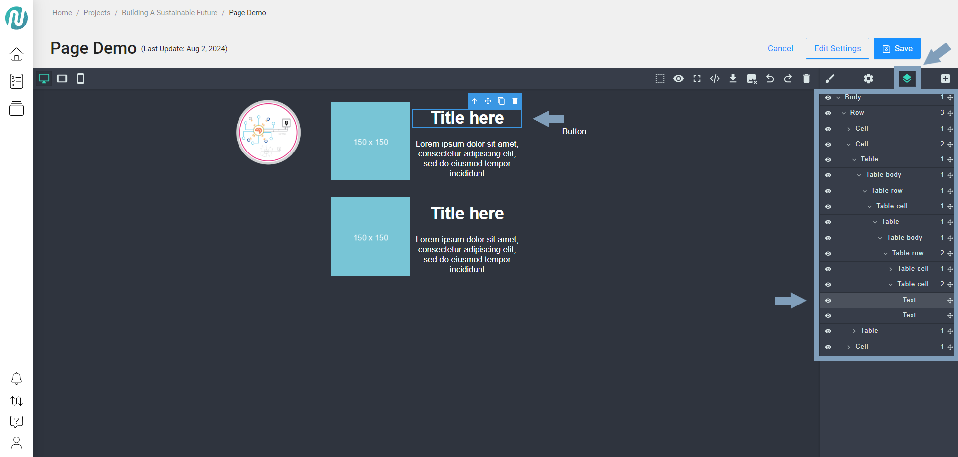
Hovering over a component will highlight the corresponding area on the canvas.
Edit Using Layer Manager
To edit the text content, double click on the text and make your edits:
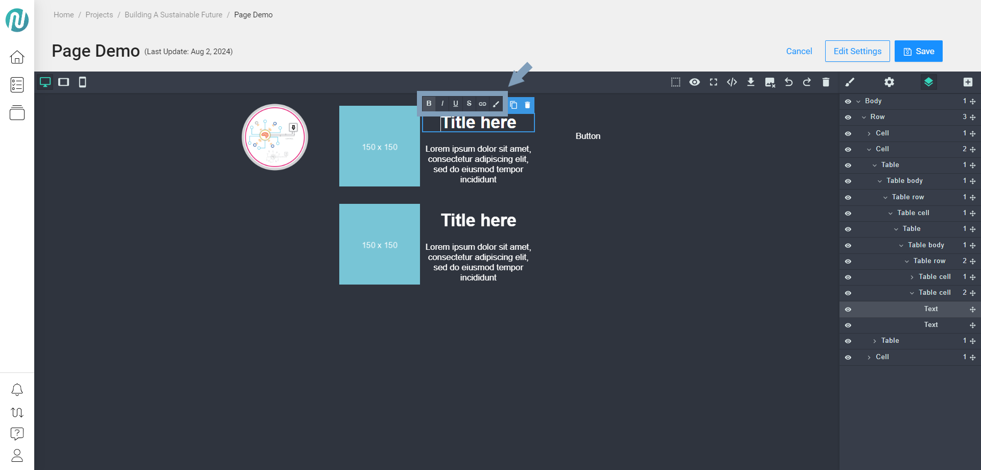
Local controls will appear above the text, allowing you to adjust settings such as making the text a link, bold, or italicized.
When you select an object on the canvas, it will be highlighted down to the specific element in the Layer Manager on the right.
Edit Using Style Manager
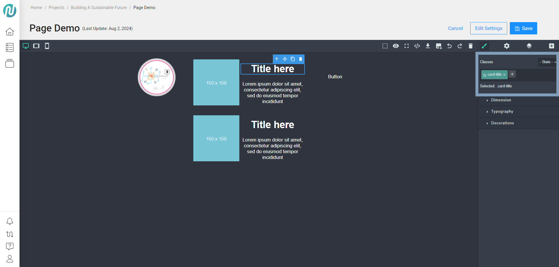
Select an element on your canvas and then click the Style Manager:
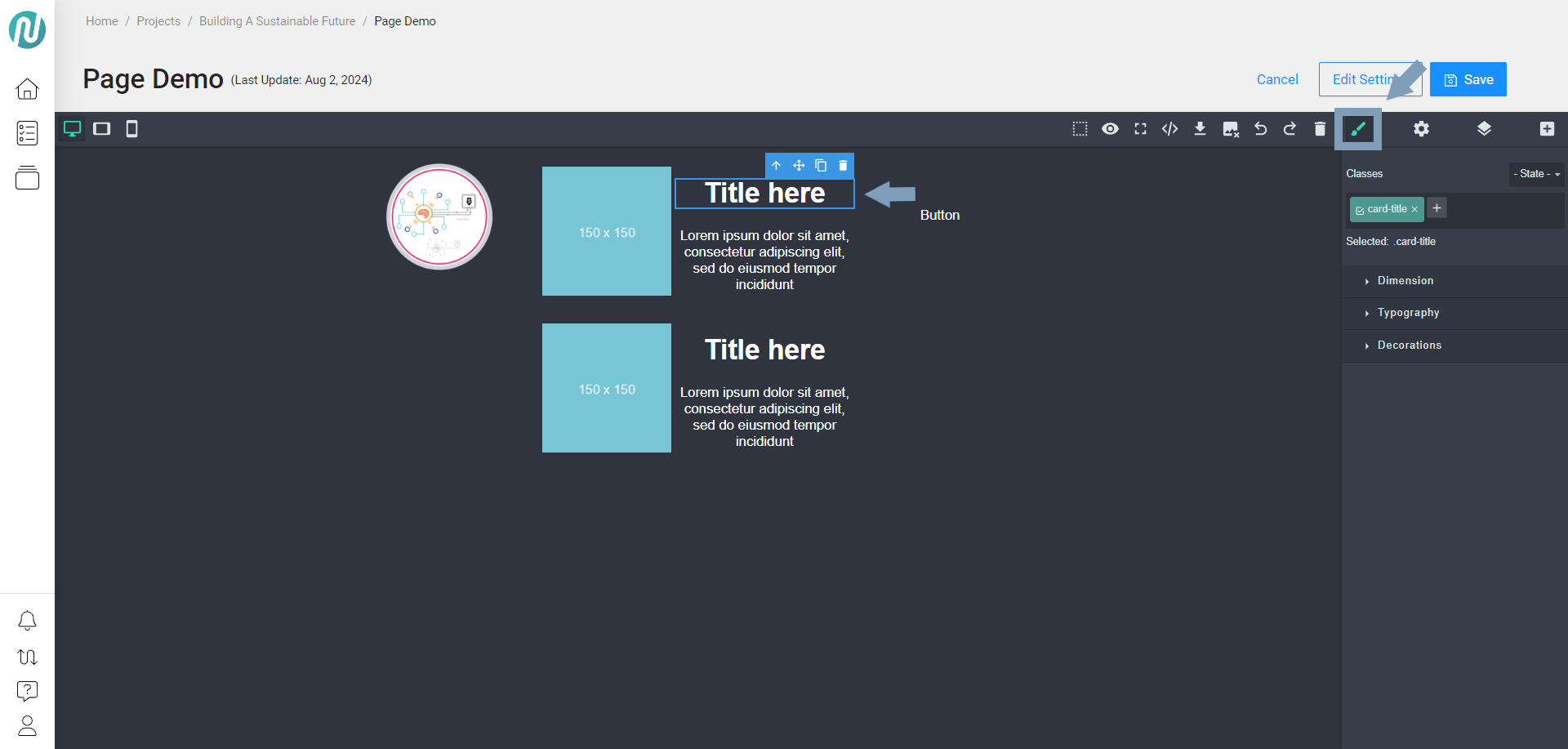
You can add classes to update elements from a Cascading Style Sheet (CSS) perspective:
You can change the dimensions in the Dimension section:
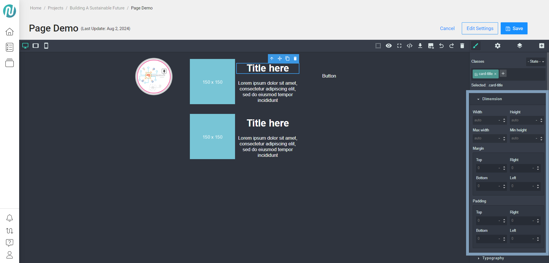
The dimensions are setup for automatic positioning.
You can adjust padding and margins, along with many other complex customizations typically done on a webpage, but all can be done visually here.
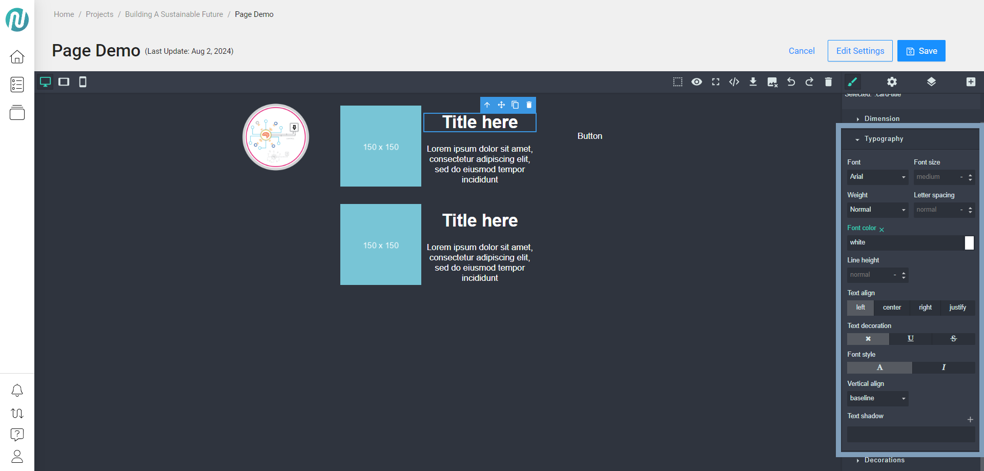
You can change the typefaces in the Typography section:
For the Image (Column 1), you can adjust the style, including height, layout, and size.
For the List Item (Column 2):
These are the default typefaces included. You can adjust the font, weight, positioning, and alignment of the elements.
As you make changes, note that sets of content are updated simultaneously because they are linked, similar to a global setting.
For the Button (Column 3), you can add interactivity. You can also customize its style in the Decorations section by changing the background, adding borders, and adjusting padding or margins.
When you close the editor, everything you have added will be saved on your local machine.
When you return to the editor, all changes will remain persistent.
Audience | Public |
Section | NimbleStory Basic |
Status | Rough Draft |
Applies to | NimbleStory 3.0 and higher |
Next Review Date | Nov 2022 |
| Version | Date | Comment |
|---|---|---|
| Current Version (v. 4) | Aug 02, 2024 18:59 | @a user |
| v. 3 | Aug 02, 2024 18:53 | @a user |
| v. 2 | Aug 02, 2024 18:48 | @a user |
| v. 1 | Aug 02, 2024 18:29 | @a user |
