Stand-alone Perspectives and Alternate Views
📔 Overview
This article provides instructions on using new features that enhances the control capabilities of perspective views. It also guides you through setting up alternative views, enabling you to configure a specific perspective, and have it function as a standalone interactive visual capability.
Concept Explorer
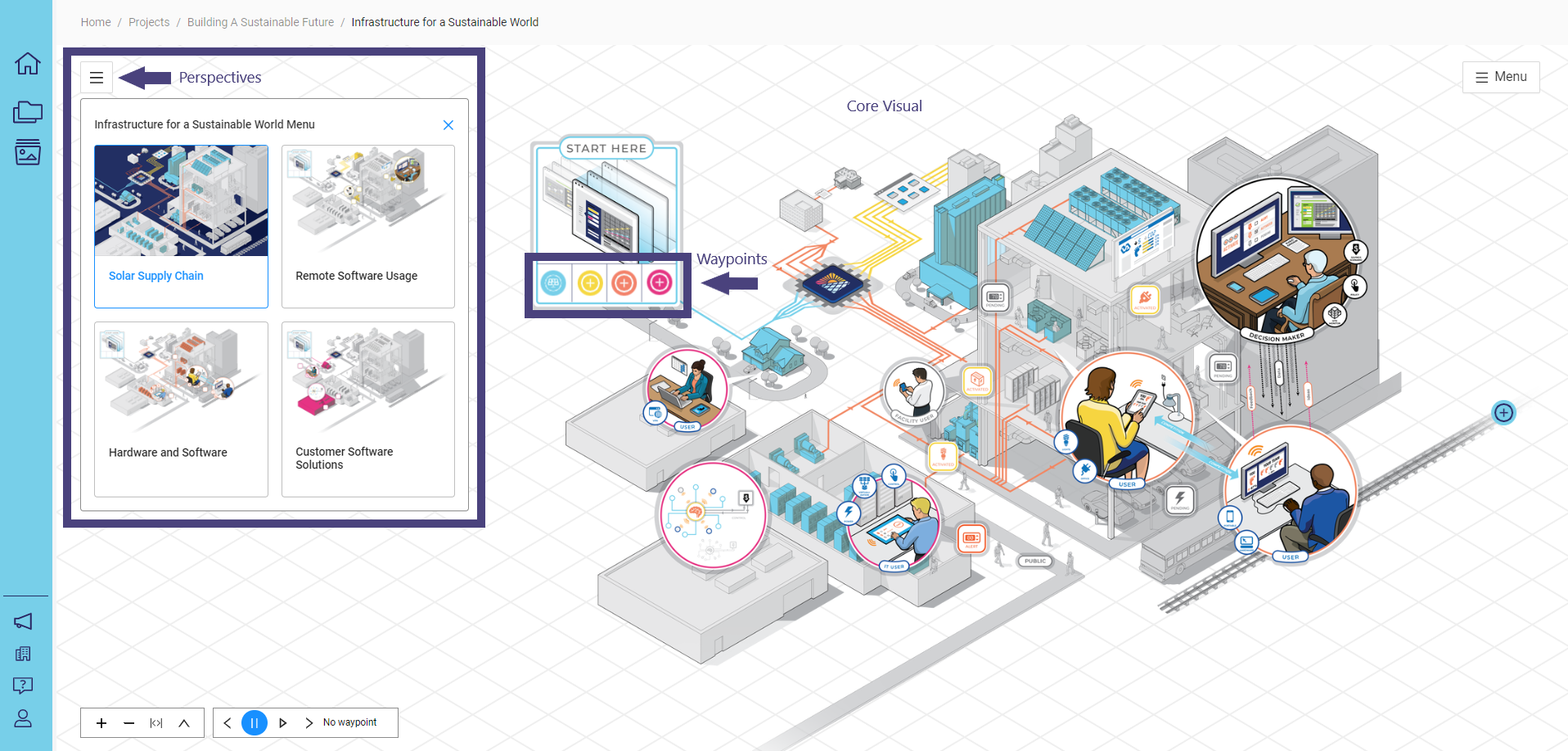
Concept Explorer, a core feature of the NimbleStory platform, uses dynamic, layered, and interactive visuals to communicate an organization’s vision and strategy. It links to specific content and interactive elements, providing detailed information about the strategies or content represented.
Core Visual: The main visual background.
Waypoints: Points where information is displayed when you hover over or click on them. Waypoints can be placed anywhere on the Core Visual.
Perspectives: Various perspectives associated with the Concept Explorer.
📘 Instructions
Follow the step-by-step instructions below to learn how to effectively use the enhanced control capabilities of perspective views.
Access Alternate Views
When accessing or building a perspective as a curator, editor, or creator, you can configure how the perspective will appear. By default, a set of new views is available.
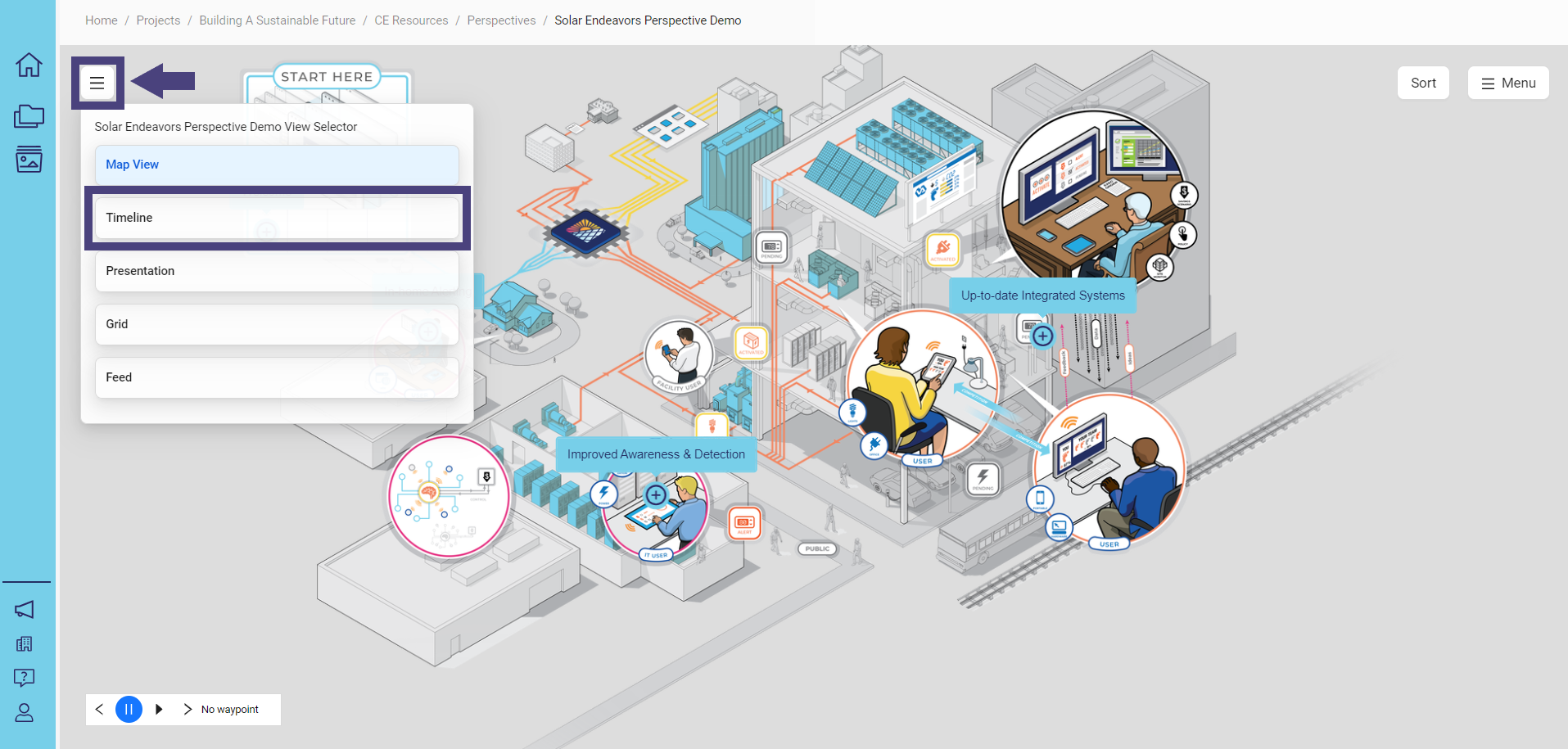
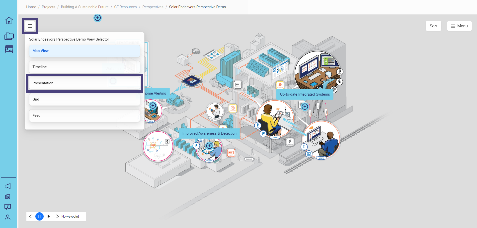
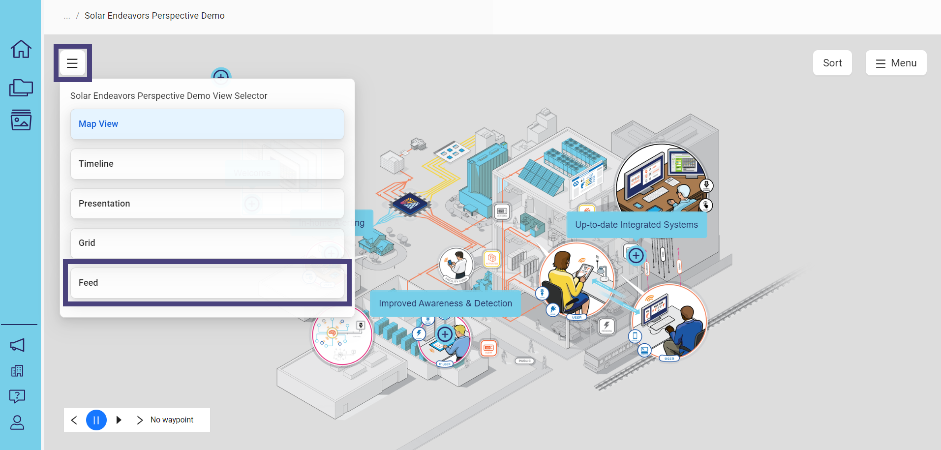
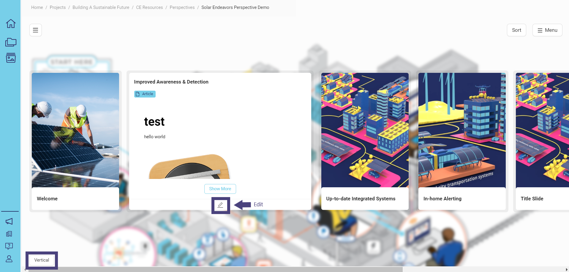
To access the alternate views, click on the box with 3 lines in the upper left corner:
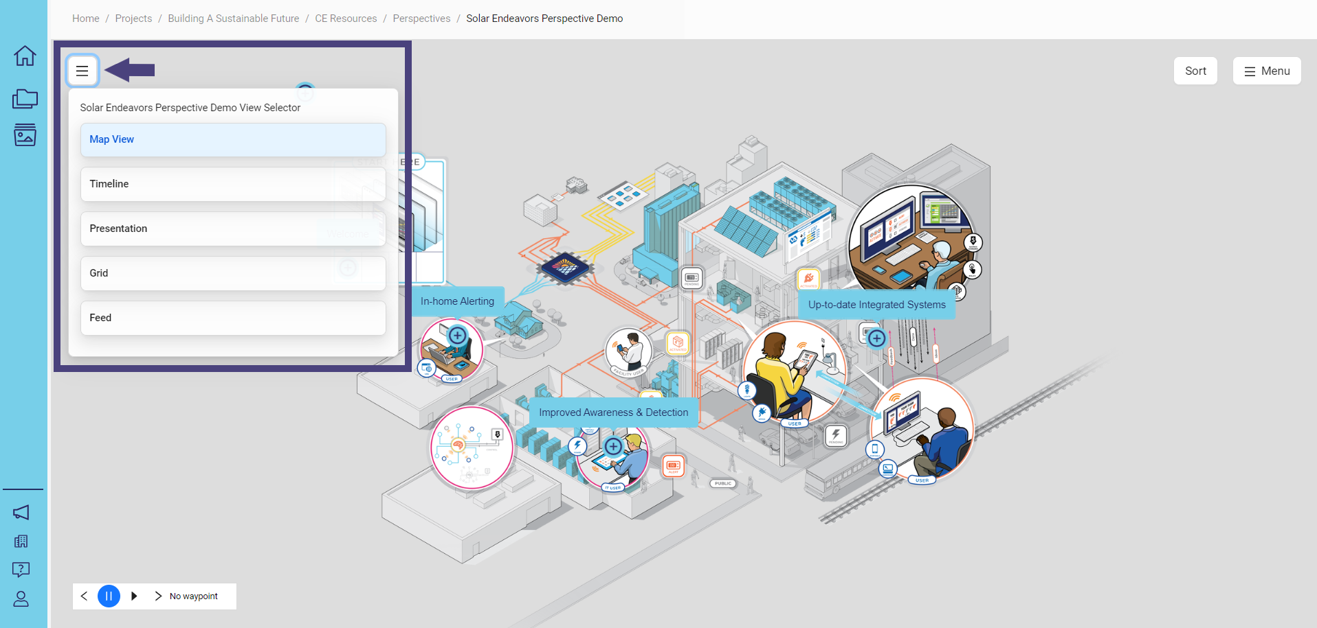
Views transform and visualize the same information in new and unique ways. This enhances your ability to drive narratives and effectively communicate your strategy, leading to more successful mission delivery. By moving from intent to realization, views help you create impact, execute plans, and achieve your vision.
Map View
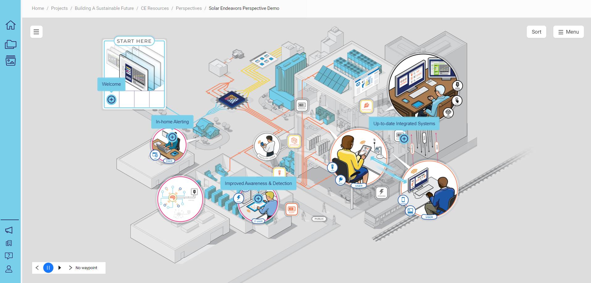
To access the map view, click on the box with 3 lines in the upper left corner and select Map View:
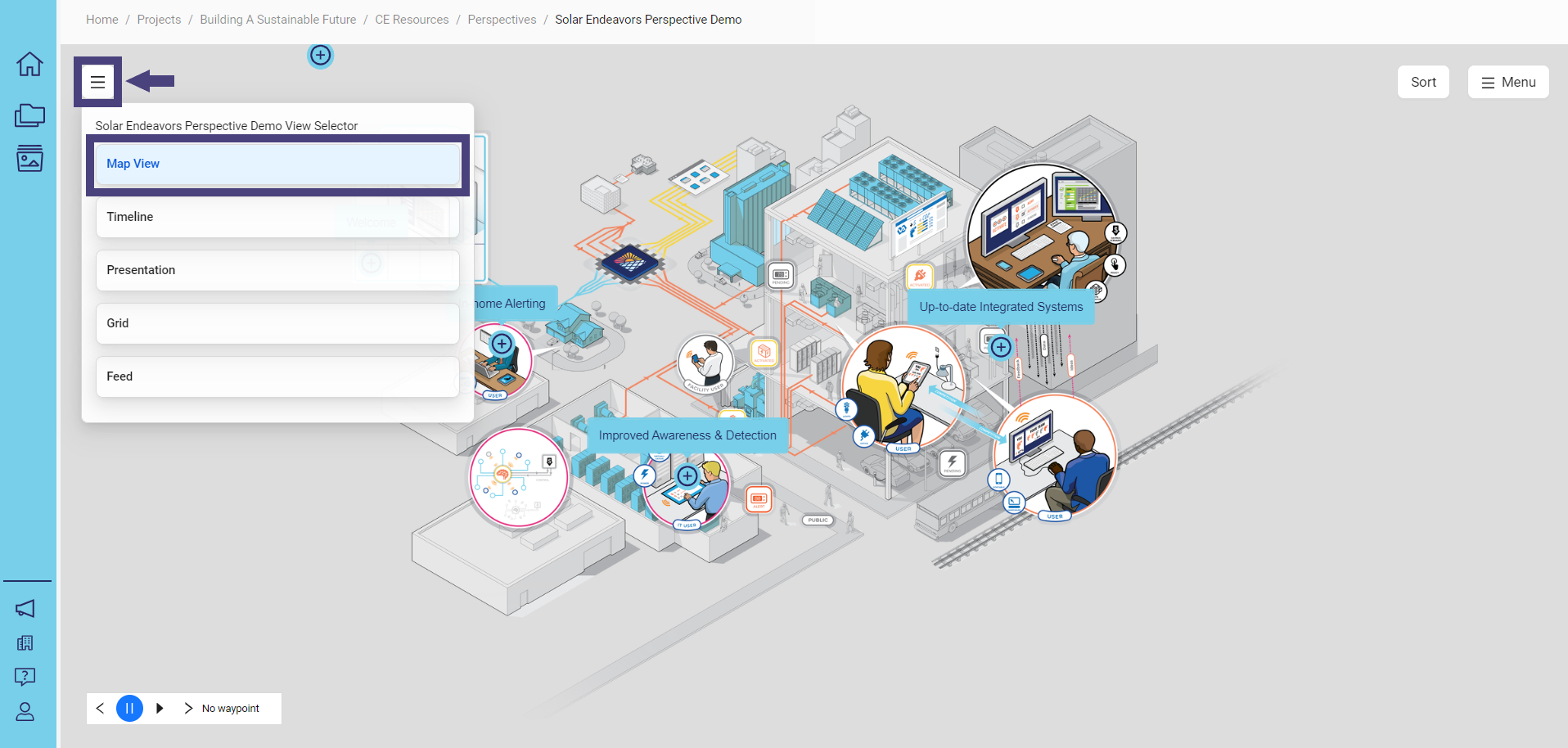
The map view displays:
Every perspective will default to the Map View unless specifically assigned to an alternative view.
Timeline View
To access the timeline view, click on the box with 3 lines in the upper left corner and select Timeline:
Cards are rendered in a horizontal timeline by default:
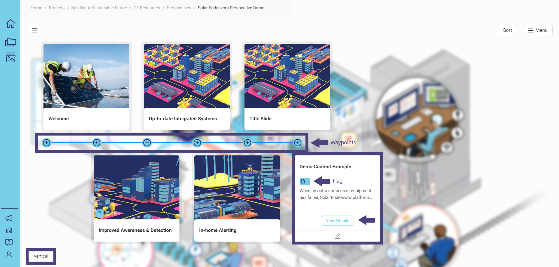
Waypoints are displayed in the center of the timeline as a circle with a plus sign inside.
Cards are displayed for each of the different elements.
Hover over the card to preview text or descriptive content that may be applied.
If there is content associated with a specific waypoint, the flag under the title will indicate the content type. Click on View Details to access the embedded content.
The embedded content for each waypoint will open and render according to your configuration, helping you to effectively communicate your story.
To view the time vertically, click on the Vertical button in the lower left corner.
Grid View
To access the grid view, click on the box with 3 lines in the upper left corner and select Grid:
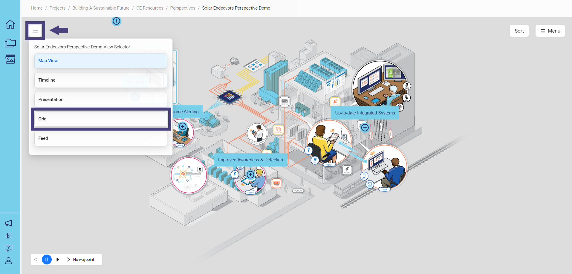
Cards are rendered as a grid:
Cards are displayed for each of the different elements.
Hover over the card to preview text or descriptive content that may be applied.
If there is content associated with a specific waypoint, the flag under the title will indicate the content type. Click on View Details to access the embedded content.
The embedded content for each waypoint will open and render according to your configuration, helping you effectively communicate your story.
Presentation View
To access the presentation view, click on the box with 3 lines in the upper left corner and select Presentation:
Cards are rendered as slides in a horizontal view by default:
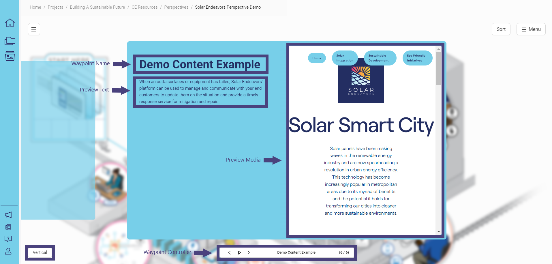
Each slide presents details about a specific waypoint.
Waypoint controller: Waypoints are listed in the order they were created.
Waypoint name: Name of the waypoint.
Preview text: Descriptive content that can be added.
Preview media: The image used as the background for the slide.
Embedded content within the preview media will be displayed when you select the waypoint.
This content can be interactive, such as an HTML file, document/web bundle, PDF, image, video, and more.
Colors are inherited from the styles you apply to your Concept Explorer.
If no styles are set, they are inherited from your organization, as styles propagate up to the organizational level.
To view the slides vertically, click on the Vertical button in the lower left corner.
Depending on how you have added information to a specific waypoint, only certain elements may be displayed:
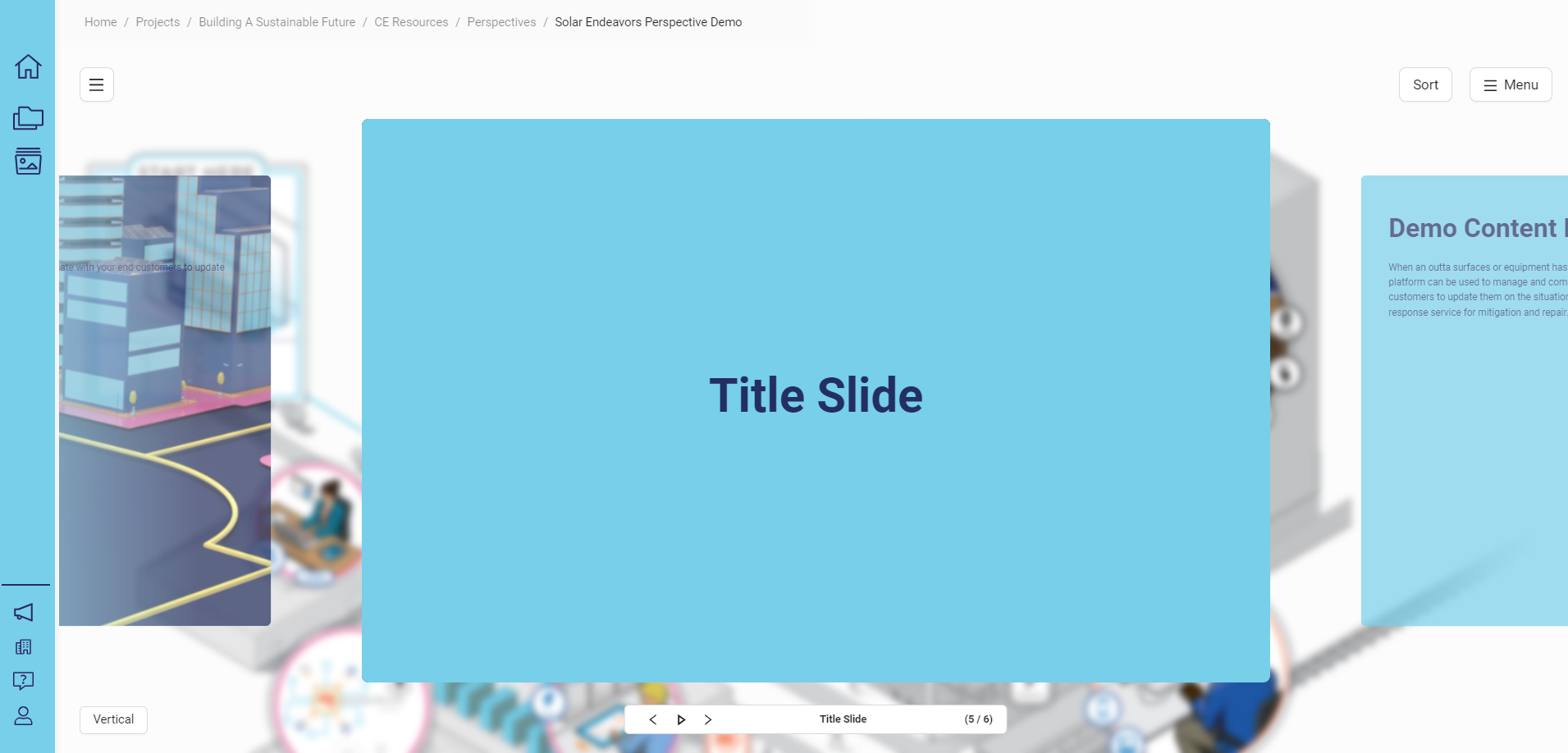
This Title Slide was created as a waypoint named "Title Slide”. It had no preview media or content to display, allowing you to design and render interesting visuals using just title labels as sections.
Feed View
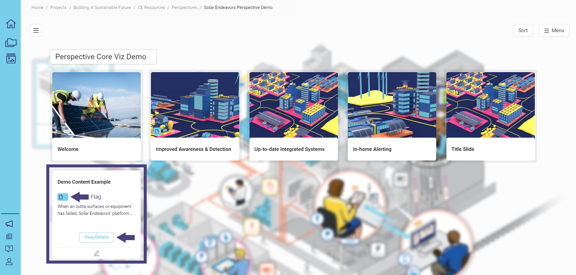
To access the feed view, click on the box with 3 lines in the upper left corner and select Feed:
Cards are rendered as slides in a horizontal view by default:
The Feed view is a straightforward model for displaying information similar to the grid view but with a more flexible structure.
The cards in the Feed view are dynamically sized, ensuring they always match the height of the tallest piece of content.
If you have edit permissions, an edit button will appear at the bottom of the card.
To switch to a vertical view for a scrolling feed, click on the Vertical button in the lower left corner.
The cards will be dynamic and adjusted to match the largest width.
If some embedded content, such as interactive embeds, is not properly sized or designed for smaller views, you might experience issues like the content appearing distorted or inconsistent.
The outcome depends on the design and layout of the content itself.
Configure Settings
As a curator and editor, you have the ability to configure and adjust the settings for how you want your information to be displayed.
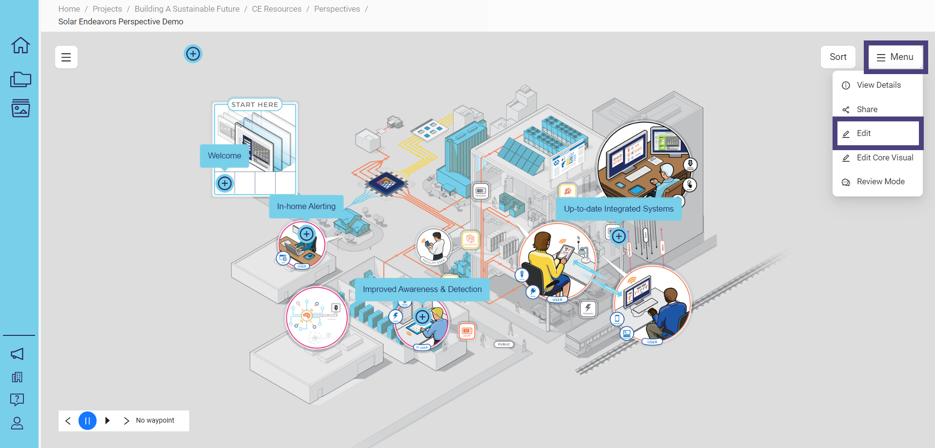
To define how your Perspective should function, click on Menu and then select Edit:
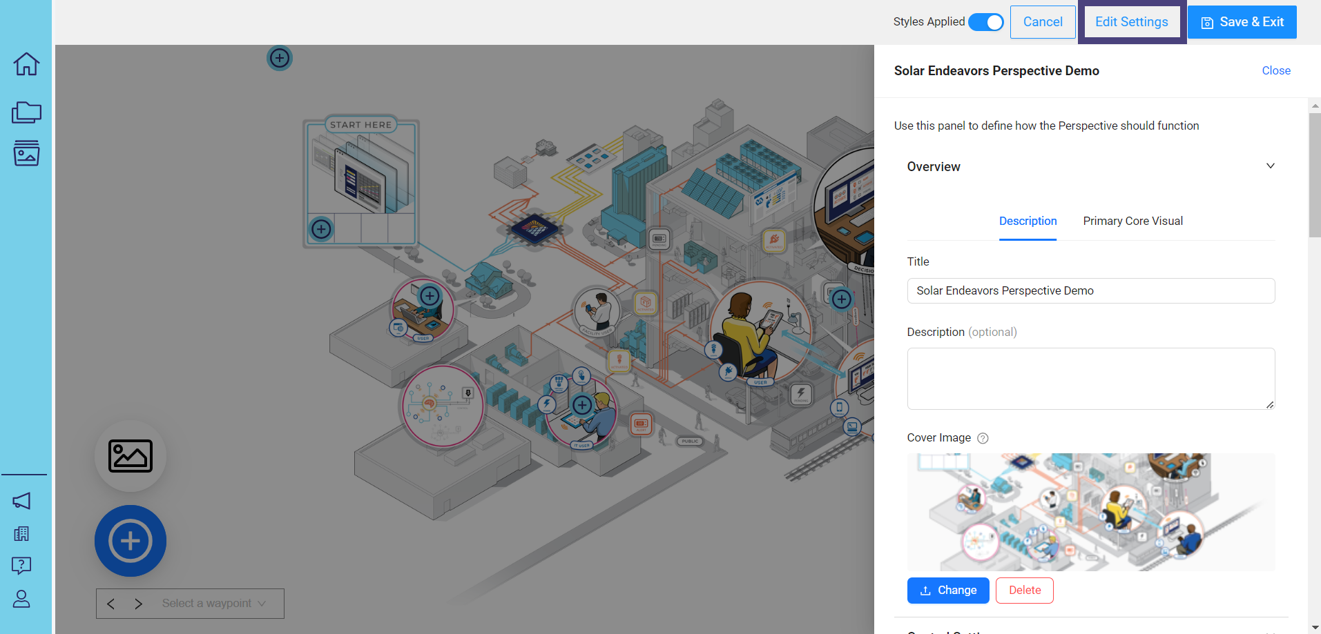
Next, click on Edit Settings:
Configure View Settings
To set the default view when the perspective is loaded, navigate to View Settings in the panel:
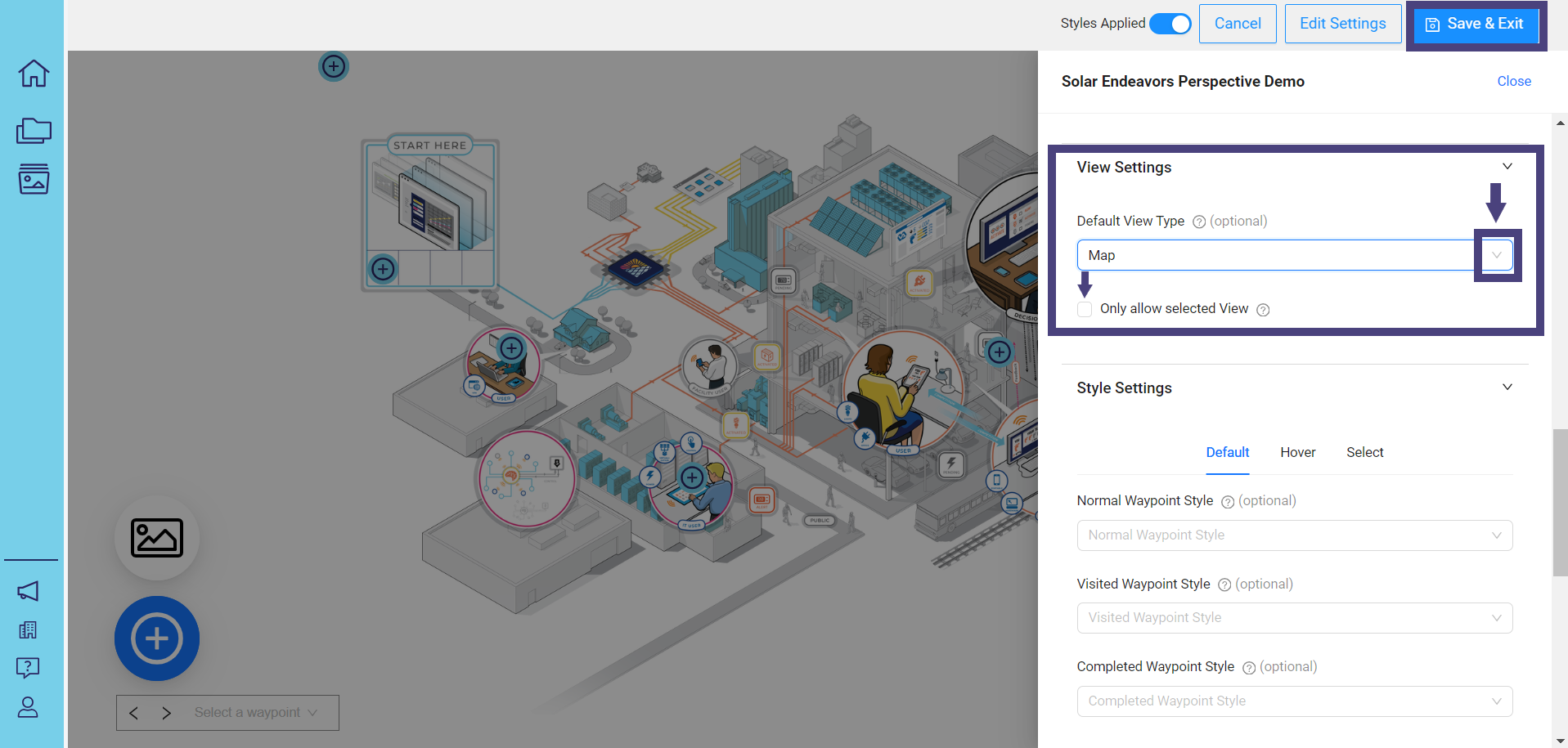
Click the down arrow in the box under Default View Type to select the view you want this perspective to open with.
If no view is selected, it will default to Map.
To lock in your chosen view, click on the box next to Only allow selected View. This will prevent users from changing the selected view when browsing the perspective.
When finished, click on Save & Exit.
Configure Style Settings
You can customize styles by navigating to the Style Settings section:
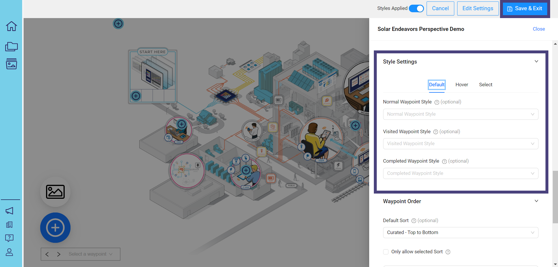
After making your selections, click on Save & Exit.
Configure Waypoint Order
You can preview how the waypoints were created and adjust the order by navigating to the Waypoint Order section:
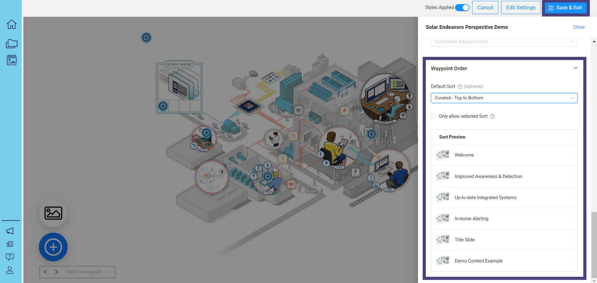
After making your selections, click on Save & Exit.
Audience | Public |
Section | NimbleStory Basic |
Status | Rough Draft |
Applies to | NimbleStory 3.0 and higher |
Next Review Date | Nov 2022 |
| Version | Date | Comment |
|---|---|---|
| Current Version (v. 7) | Jul 18, 2024 17:50 | @a user |
| v. 6 | Jul 03, 2024 21:31 | @a user |
| v. 5 | Jul 03, 2024 21:27 | @a user |
| v. 4 | Jun 28, 2024 21:03 | @a user |
| v. 3 | Jun 28, 2024 17:22 | @a user |
| v. 2 | Jun 27, 2024 22:27 | @a user |
| v. 1 | Jun 27, 2024 22:25 | @a user |